
© Pujie.
 arrow_back
Editable elements are those which can be designed in the watch element designer.
Below you can see a tutorial video of how to create a watch hand using the watch element designer.
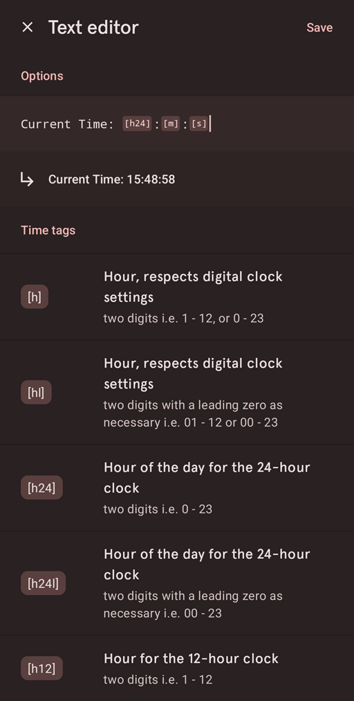
A custom element can use text tags to display data. You can add all kinds of tags and it is not limited to one data source.
The custom element allows you to add 'live text', using text tags. When changing the text on a text layer you will have some extra options in the text dialog. You can add all kinds of text tags to add dynamic text to the part.
Just tap one of the tags, and it will be added to the input text. You can also write the tags in the text using the keyboard.
Custom elements can also be automated using javascript. The same tags can be used to position and transform your layers, so you can create custom automated watch elements.
Read more about automation in the automation section of the watch element designer manual
A complication is any feature in a watch face that is displayed in addition to time. For example, a battery indicator is a complication.
Wear OS has a specific API for creating complications, Pujie Watch Faces adds to that by allowing the user to design the drawing style of a complication.
A custom complication in Pujie Watch Faces is a drawing style for a certain type of data. The complication you create, defines how it looks. Afterwards you can assign data from different sources to you complication drawing style.
The image below, from the Wear OS developer pages, shows the 6 different complication types available.
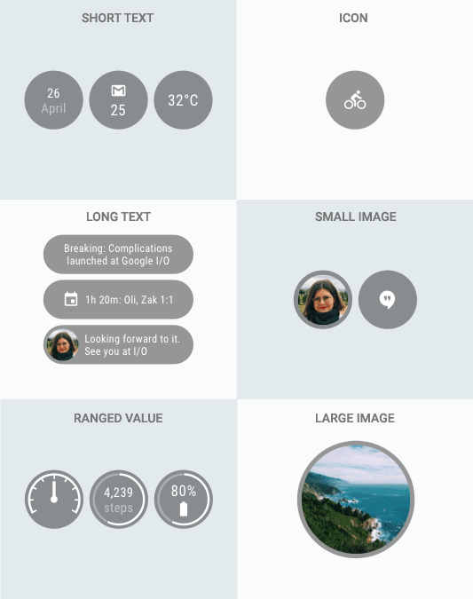
The complication types section describes these types in detail.
To illustrate, your drawing style is never specifically a battery complication for instance, it could be used to show battery data, but it should also work for any other data which has the same type.
This might sound complicated, and initially it may be, but once you understand it, it is very powerful. You define your drawing style once and later you can assign any data source to it which fits the profile.
Below you can find some links to more documentation about the Wear OS complication system.
When you create a new complication, you will first have to choose it's type. You can choose from the 6 options as shown in the image above. Each complication has a set of required fields and a set of optional fields.
Complications are designed in the Watch Element Designer. For each of the required and optional fields a locked layer will be added to your complication by default. For instance, this is shown in the image below for a ranged value complication.
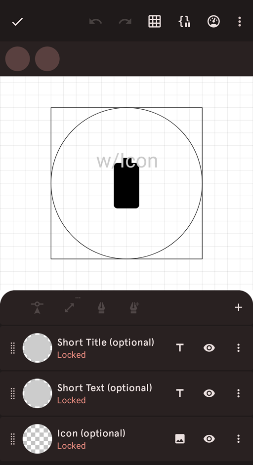
These locked layers have to be incorporated in your design (or you can choose to make them invisible, if your drawing style works better without). But the field connected to these locked layers might not contain a value for each data provider. The goal is to make your design work with each data provider.
Tap the following button to see what your complication looks like with a different data provider.
Each complication type has several data providers built in Pujie Watch Faces. For instance a ranged value complication has data providers for the phone battery, watch battery and more.
The image below shows the dialog used to pick your data provider
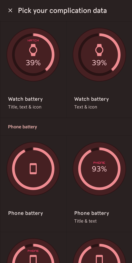
Note that the complication shown in the dialog above uses the same style but is taylored to the data. Ideally your drawing style should work well with all the data providers in this dialog.
To achieve this you can make use of Automation. This is discussed in the automation section of the Watch Element Designer manual.
Using automation you can for example rotate a layer, based on the value supplied with a ranged value complication. And using visibility automation you can hide layers if they should not be shown in a certain configuration.
Please have a look at some of our video tutorials to better understand how to create your complication.
Each of the complication types has a set of test data providers. These don't supply a meaningful value and are not meant to be used in your final design, but are very helpfull in testing your complication.
Some complications have tap actions assigned to them. So when you tap the watch face a ripple will be shown to indicate it's tap area. You can customize the shape of this ripple by adding a shape layer with the name Outline to your custom element. See the video below for a demonstration.
Because this system matches the official Wear OS Complication system, you can assign external data providers to your complication as well.
This can only be done from the Pujie configuration menu on your watch. Follow these steps to assign your external data provider.
Below you can find a description of each of the 6 complication types.
A short text complication may be just a single piece of text, or a title and text, or an icon and text. Examples include weather or calendar information.
An icon complication can be used when text is not needed. The icon is expected to be single-color, and can be tinted. It could for instance be an icon depicting the current weather status, or just a button to start an action.
A ranged value complication can display data which includes a numeric value. The numeric value comes with a maximum and minimum value, so that it can be displayed relative to these bounds. It could for instance be a gauge which shows your daily steps or your battery levels.
A long text complication is used when you would like to show more text. It could for instance be your upcoming calendar items, or a description of the current weather.
A small image complication has one of two styles: photo style or icon style. Photo style means it should fill the space and can be cropped.
A large image complication can be used to fill the watch face with an image. It could be the cover art of your current media, or just a nice background image.